Spark Enterprise Design System
Spark is Sabre’s Enterprise Design System, a design language consisting of re-usable user interface components. It was created to drive quality and consistency across Sabre’ product development lifecycle, and to enable faster time to market.
I joined the Spark team in mid-2016 as a Design Technologist working with Front-End technologies. My immediate focus was developing new components, maintaining existing components, and writing documentation for the Design System. Since that time, my role grew to include leadership roles as the team grew to include additional Design Technologists. I also took on the role of leading adoption of Accessibility standards within the component library and within the company itself.
Spark Component Library
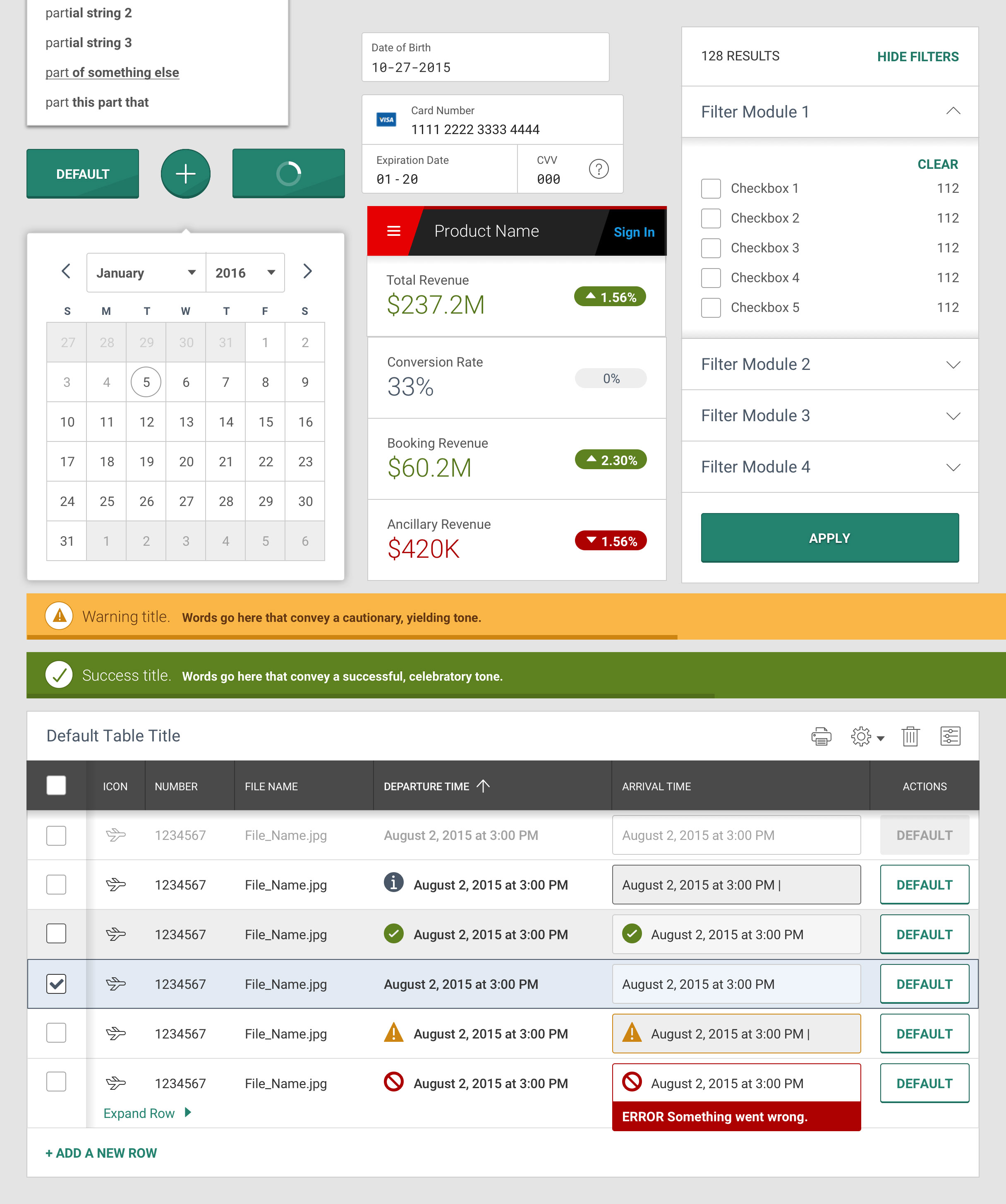
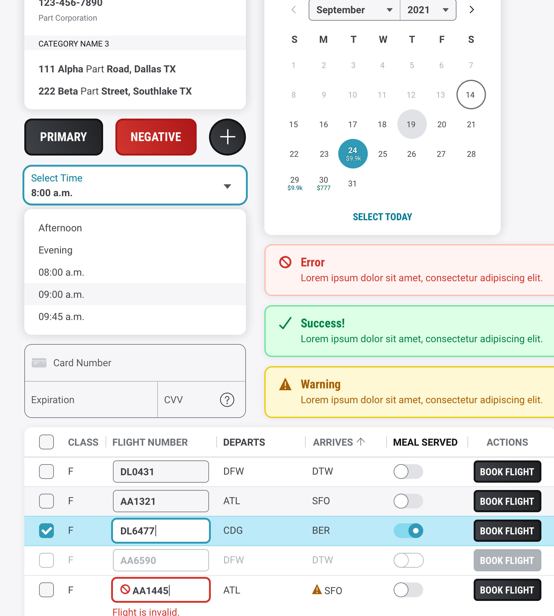
The Spark Design System consists of over 40 distinct components, each with multiple variations to support different scenarios within products using the library. These components are developed using HTML, CSS and vanilla Javascript. Components and patterns I have coded myself include the Auto Suggest, Filter, and Time Selection components among others.
Our process for getting components into the library included reviewing products created by the company and identifying common components used in multiple products. After understanding their usage and noting need in other products, we would design, code, document and release the component in a form that would support most product needs.
Spark Classic
The previous iteration of the Spark Design System is known as Classic Spark, and its visual style has existed since the inception of the Design Language.
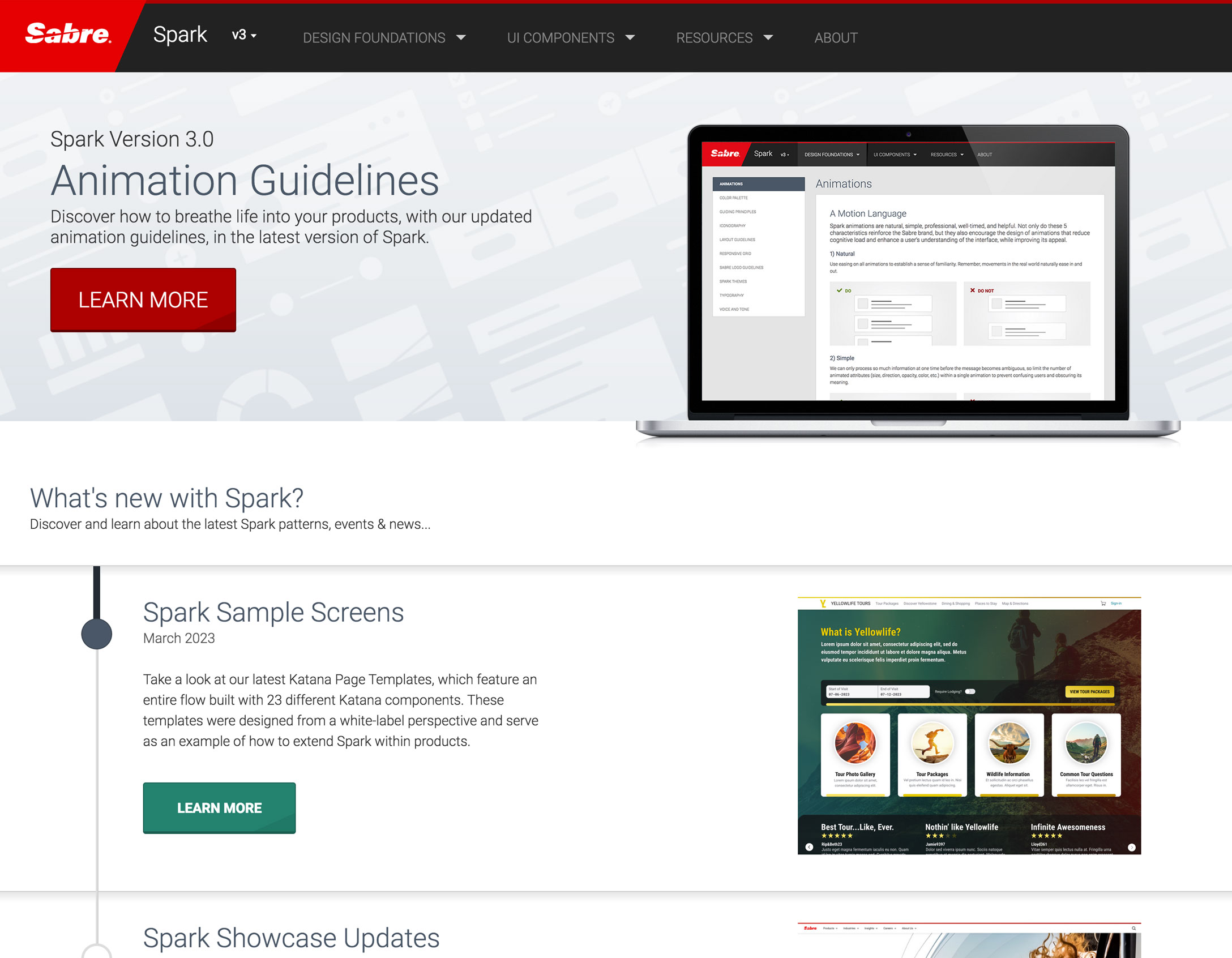
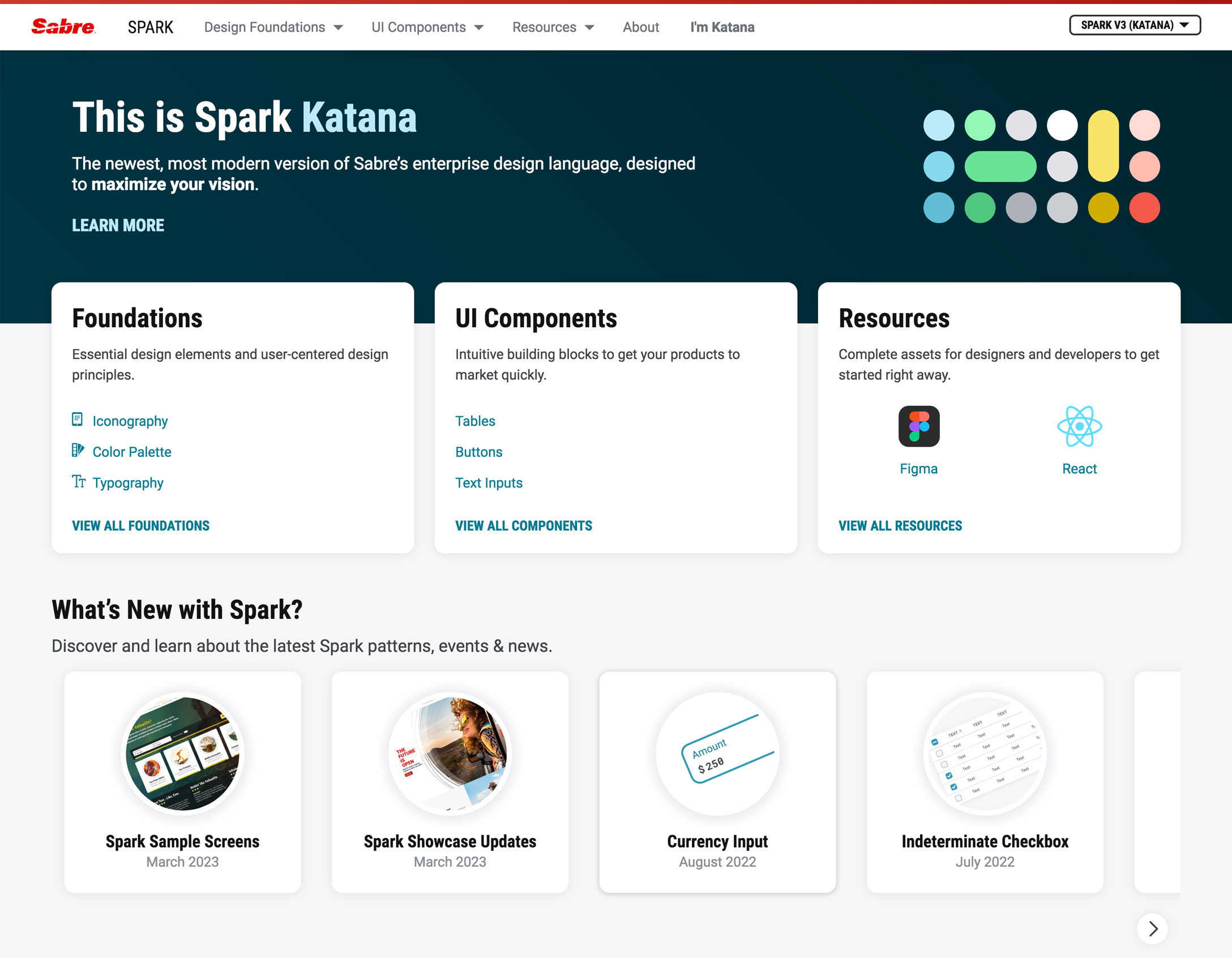
Spark Katana
The current iteration of the Spark Design System was released as a new theme in 2021, after 2 years of active design and development. It was created to update and modernize the visual style of the language and introduce more pops of color. The Katana theme is the future direction of the Spark design language.
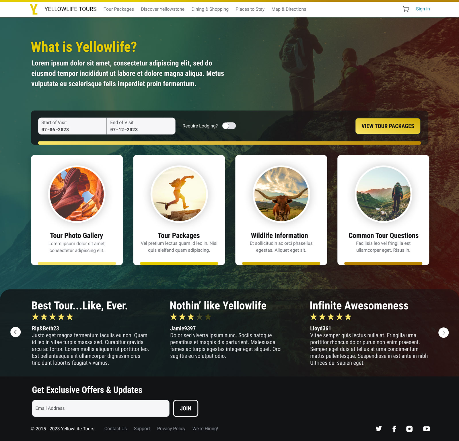
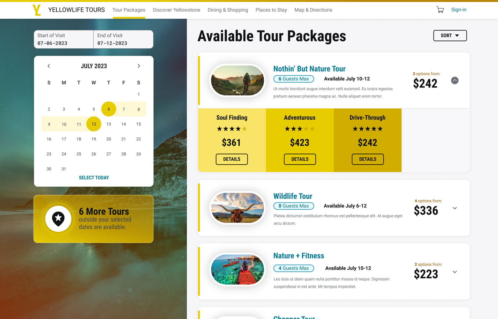
Demonstrating Capabilities of the Design System
The Spark Design System is intended to allow customization and extension especially in white-label products and applications where it is important to adopt and feature a customer's brand guidelines. To demonstrate the capabilities of the design language, we designed layouts that use core components to illustrate how far the language could be pushed to come up with unique designs.